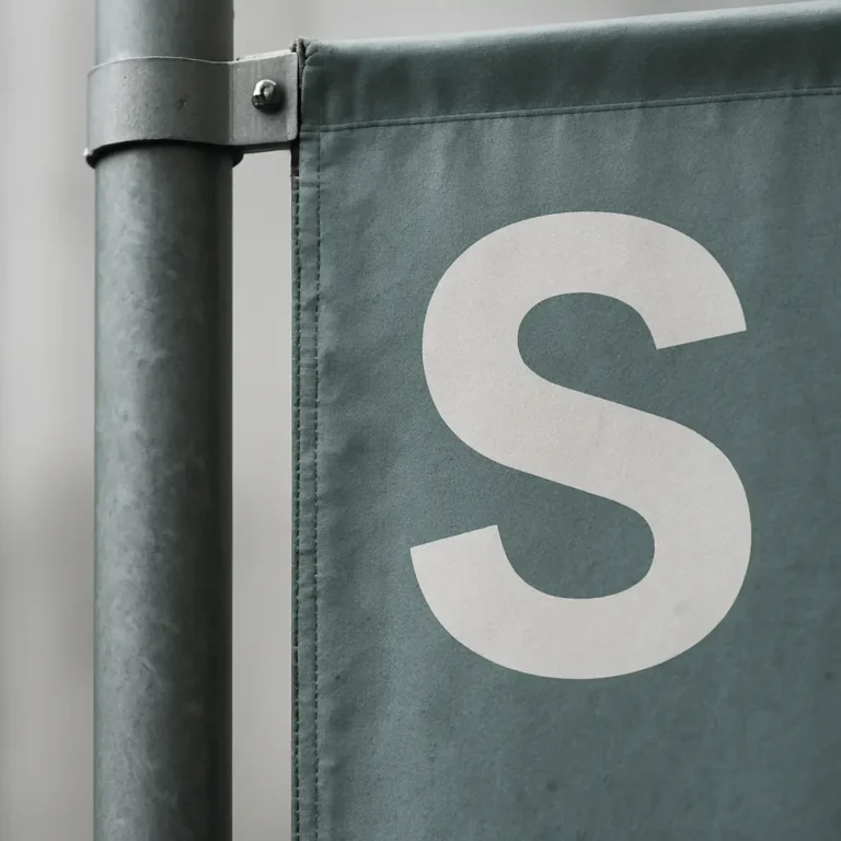
Advertising banners are visible displays used to identify businesses, guide visitors, and communicate promotions in physical spaces. Choosing the format, message, material, and location depends on reading distance and installation conditions. This guide brings together criteria for designing, maintaining, and evaluating their usefulness.
Advertising banners often seem like a simple, almost secondary resource, but on the street they compete with an advantage: rather than waiting for customers to look at a screen, they interrupt their line of sight. This ability to capture attention in motion explains why they remain so effective for stores, trade shows, events, and local campaigns.
What are advertising banners and what are they used for?
An advertising banner is a vertical, lightweight, visible display designed to communicate a message at medium and long distances. Its effectiveness depends on a combination of physical and psychological factors, beyond size and color. In urban and commercial spaces, people scan information quickly. They identify shapes, contrasts, short words, and directional signals within seconds. Banners exploit that behavior by rising above the usual visual plane, breaking the monotony of façades, shop windows, and street furniture, and maintaining a continuous presence without requiring prior interaction.
One of the most common outdoor marketing mistakes is assuming every visual impression has equal value. It does not. A fixed wall poster can blend into its surroundings; a screen can compete with reflections or distractions; a large vinyl banner can lose detail at close range. Vertical banners, by contrast, work particularly well in the middle ground: they are seen as pedestrians move, vehicles slow down, or visitors explore a venue looking for clear landmarks. This makes them useful in campaigns where wayfinding, visual repetition, and immediate brand recognition matter.
Types of advertising banners and when to use each
Not all serve the same objective. Façade banners installed perpendicular to the street are especially effective for businesses on pedestrian routes. They work better than many front-facing signs because people do not need to be directly in front of the premises to notice them. A restaurant on a narrow street, pharmacy, specialist store, or clinic gains considerable value from this format, which turns its location into a signal visible from different angles.
Fly banners or sail flags follow another logic. They are common at events, temporary promotions, car dealerships, sports centers, trade shows, and venue entrances. Their main advantage is relative mobility and easy outdoor installation with little preparation time. They also add dynamism because moving fabric naturally attracts the eye. That detail matters more than it seems: the human eye detects movement before something completely still.
There are also institutional or urban banners, widely used by municipal authorities, cultural centers, and festival organizers. They serve two purposes: communicating a campaign and visually dressing an area. Installed in a series along an avenue or on lampposts, they create repetition, one of the strongest mechanisms for advertising recall. Seeing the same visual code several times within minutes fixes a name, date, or message more effectively than a single large piece.
Design: less decorative creativity, more visual intelligence
Most banners fail from excess, not shortage. People try to fit a logo, photograph, promotion, lengthy web address, social accounts, phone number, slogan, icons, and secondary colors, as if every centimeter of print needed justification. The result is usually illegible at the actual viewing distance. An effective banner selects the essentials and makes them visible in less than three seconds.
Visual hierarchy governs. First should come what viewers need to understand immediately: the brand, business category, or a clear promise. If a bakery uses a banner to attract people twenty meters away, a large word such as Bakery or a concrete proposition such as Artisan bakery will probably work better than a product collage. At a professional trade show, it may be more profitable to highlight the company name and a direct benefit such as Logistics solutions or Industrial textile printing.
Contrast is decisive. Dark text on a light background or light text on a dark background generally performs better than complex photographic backgrounds. Typography should be sturdy, clean-lined, and sufficiently spaced. Many designers choose elegant lettering that works on screen but fails completely outdoors. A banner requires instant reading. Type that is too thin, condensed, or decorative loses effectiveness with wind, movement, distance, or changing light.
Color should also respond to a strategy. Strong corporate colors can aid recognition, but if the surroundings are already saturated with similar stimuli, seek contrast with the actual setting. On a street full of red signs, a deep blue or black banner with white text may stand out more. In landscaped areas, clean, warm colors often gain presence. Designing without considering physical context is working blind.
Materials, printing, and durability: what becomes apparent too late
For outdoor displays, initial aesthetics matters less than durability under real conditions. Fabric, printing quality, stitching, and the structure influence both appearance and useful life. Poor-quality material can lose tension, deform, or fade quickly under sun, rain, or friction. This makes the piece unattractive, conveys neglect, and damages the business’s image.
UV-resistant inks and fabrics intended for outdoor use help colors last. In windy areas, flexibility and construction are essential. A very taut banner can suffer more structural wear than one designed to move with the wind. In sail-style models, pole shape and fabric tension directly affect message readability. If the surface continually folds over the main word, the piece loses much of its function.
The base or anchoring system deserves equal attention. On hard ground, a heavy base or mechanical fixing may be appropriate. On beaches, grass, or soft ground, the anchoring changes. Choosing poorly causes instability, leaning, or even safety risks. In professional settings, an inadequately secured banner is no minor issue: it can become an operational incident and harm perceptions of brand competence.
Location and orientation: a good piece poorly placed has little value
The effectiveness of advertising banners depends as much on placement as design. This seems obvious, but many decisions are made without observing the audience’s actual routes. The right question is where the banner will first be seen and for how long. On a shopping street, pedestrian-flow direction and the side most people walk on matter. On a secondary road, visual exposure time and average speed matter. At an event, the key is where people begin looking for landmarks to navigate.
Height matters greatly. Placed too low, the banner can be hidden by cars, street furniture, or groups of people. Raised too high, it requires viewers to look up excessively and becomes harder to read. Its angle to the route also changes performance. A perpendicular banner usually attracts attention better on façades, while a slight angle toward the main flow can improve legibility at entrances or along internal routes.
Strategic repetition multiplies results. One banner can indicate a location; several well-distributed banners build presence. At trade shows or in urban campaigns, seeing the same visual identity at different points creates continuity and reduces a sense of fragmentation. The goal is to establish visual landmarks accompanying users. A visitor who sees one piece at the entrance, another at the main turn, and another beside the destination arrives better oriented and recalls the brand or event more clearly.
Uses for banners in stores and events
This display clearly stands out in certain contexts. On streets with overloaded shop windows, banners help businesses stand out without requiring passersby to stop. For impulse businesses such as cafés, ice cream shops, or convenience stores, a brief, visible phrase can turn passing traffic into visits. At sports or cultural events, their ability to mark zones and reinforce sponsors makes them useful because they combine wayfinding and commercial presence.
In property developments, car dealerships, and temporary exhibitions, banners work well because of their scale and flexibility. They mark boundaries, entrances, and highlighted areas without heavy structures. On university campuses, in hospitals, or at large venues, they can support signage and help newcomers navigate. When people do not know a location well, any display reducing uncertainty gains immediate practical value.
They are also effective in seasonal campaigns. Sales, openings, local celebrations, launches, and anniversaries benefit from a quickly installed solution conveying visual urgency. With a clear message and imagery consistent with the brand, banners can accelerate awareness over short periods when more complex permanent displays are not always worth the investment.
Common mistakes that reduce their impact
One common error is confusing visibility with saturation. An enormous banner, too many colors, or excessive text does not guarantee better results. Usually, it worsens them. Another mistake is designing on a monitor and approving without full-scale tests. What seems legible on screen may become unrecognizable at fifteen meters. Printing a sample or simulating the size on a photograph of the setting prevents costly decisions.
Ignoring maintenance and cleaning is another mistake. Outdoor displays accumulate dust, moisture, and wear. Left unchecked for months, they lose presence even with good design. For long-running institutional or commercial campaigns, plan inspections of tension, fastenings, fabric condition, and color fidelity. Outdoor advertising requires management after installation.
Another common problem is a mismatch between the banner’s message and the rest of the visual identity. If the shop window communicates one thing, the website another, and the banner something else, cognitive friction arises. People see but do not fully understand. Consistency between the physical channel and the brand matters more than an individual piece’s originality.
How can you measure advertising banner results?
Measuring a banner’s impact does not always require sophisticated systems. In retail, compare incoming footfall before and after installation, especially during similar time slots. At events, observe whether locating entrances, exhibitors, or specific areas improves, reducing requests for directions. In promotional campaigns, associating a particular message, visual reference, or offer with that display is sometimes enough to identify responses.
The most useful measurement is quantitative and behavioral. If people turn their heads, change direction, recognize the premises sooner, or locate a stand faster, the banner is doing its job. Even without exact sales attribution, its value can be clear when it improves recognition, wayfinding, and consistency of physical presence. In many businesses, that accumulated effect matters more than an immediately attributed conversion.
How can banners complement digital advertising?
The idea that physical displays have lost relevance to digital media creates a simplistic opposition. Advertising banners cover a different phase of audience contact from digital channels. While online advertising targets interests, banners act on context. They capture people already nearby, on the move, deciding in the moment, or needing a spatial reference to enter, turn, or stop.
They also have an often-overlooked advantage: they do not depend on batteries, connections, screen formats, or algorithms. Performance rests on more basic, stable principles: location, contrast, scale, and repetition. When these are well executed, the display keeps working efficiently day after day. It is no coincidence that despite technological advances, many brands still use banners at openings, sponsorships, trade shows, and high-traffic commercial locations.
In a landscape full of fleeting stimuli, a well-positioned banner demonstrates that attention can be won by what makes itself understood before pedestrians take their next step.
Before producing your pieces, review whether the message and visual codes are consistent with your brand. Our branding and brand identity service can help organize that visual and verbal foundation across different touchpoints.